Sol
 ++
++
The Brief
A planning system guided by the body.
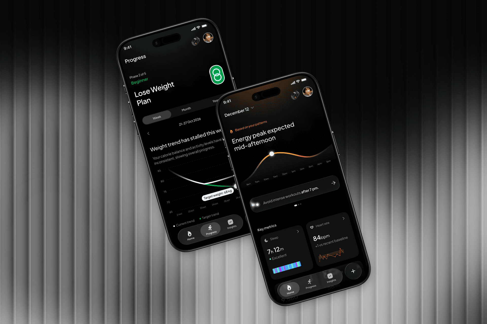
Most health apps hand you numbers and leave you to figure out what they mean. Heart rate. HRV. Sleep score. A wall of metrics that tells you everything except the one thing you actually need to know — what should I do today, and when?
Sol is a premium health and fitness tracking app built around a different idea entirely. Instead of showing users data, it reads their body's natural rhythms and tells them what to do, when to do it, and how hard to push. The brief was to design a luxurious, sophisticated mobile experience that tracks health metrics, surfaces personalised fitness plans, and delivers detailed analytics — all without overwhelming the user.
The challenge was not just making it look premium. It was making complex biometric data feel effortless and human.
4
Core constraints
Identified before a single screen was designed
5
Competitors benchmarked
Apple Health, Whoop, Oura and more
End to End
Full design ownership
Research, ideation, visual design and documentation
The Problem
People don't struggle with data. They struggle with direction.
Health apps have a data problem — not a lack of it, but too much of it presented in the wrong way. Users are handed heart rate numbers, HRV scores, sleep percentages, and step counts with no context for what any of it means in the moment. The result is an experience that feels more like a medical dashboard than a personal guide.
Four questions kept surfacing in research, across every type of user:
"I don't know what to do today."
Too much data, no clear starting point. Users open the app and feel overwhelmed before they have even started.
"I don't know when to do it."
Timing matters as much as the activity itself. A workout at the wrong time in your recovery cycle does more harm than good. No app was telling users this.
"I don't know how hard to push."
Effort without context is guesswork. Users were either under-training out of caution or over-training out of ambition, with nothing to guide the middle ground.
"I don't know if I'm pacing well over time."
Progress is invisible when you are only looking at today. Users had no way to understand whether their patterns over weeks were moving in the right direction.

The Approach
Understanding the body before designing for it.
Before any wireframe or visual decision, the work started with building a genuine understanding of the problem space. Health and fitness is a domain where bad design does not just frustrate users — it creates anxiety, compulsive behaviour, and eventually disengagement. Getting the approach wrong had real consequences.
The process followed three phases, each informing the next.
1. Building domain knowledge
The first step was reading. Articles on wearable technology, biometric tracking, and how health apps process body data. The goal was not to become an expert but to understand what was actually being measured, what the data meant, and where the gaps between raw signal and human understanding were widest.
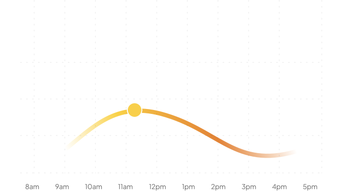
One insight became the anchor for everything that followed: bodies operate in rhythms, not scores. Energy rises and falls during the day. Recovery improves or degrades across nights. Sleep quality stabilises or destabilises across weeks. Stress accumulates and releases in patterns. Designing around this meant ditching the score-based model entirely and building around time and rhythm instead.
2. Identifying constraints early
Rather than jumping to solutions, the next step was mapping what could go wrong. Four constraints were identified before a single screen was designed:
Wearable data is noisy and incomplete — the system had to make good decisions even with imperfect inputs.
Users do not understand most health metrics — everything needed to be translated into plain language before it reached the screen.
Scores create anxiety and compulsive checking — Sol would guide, not judge.
Guidance needs timing, not frequency — the right nudge at the right moment matters far more than constant reminders.
These constraints became design principles that every screen was tested against.
3. Competitive landscape
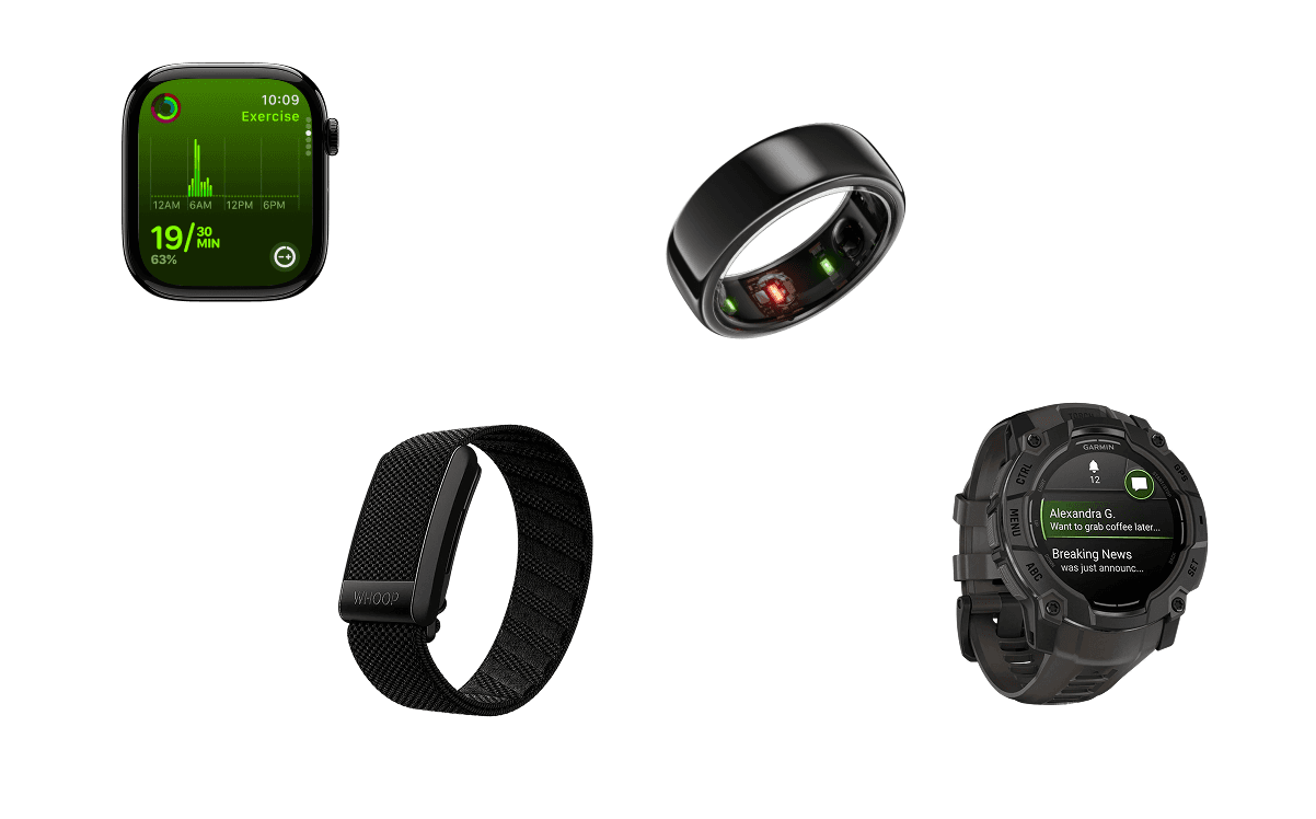
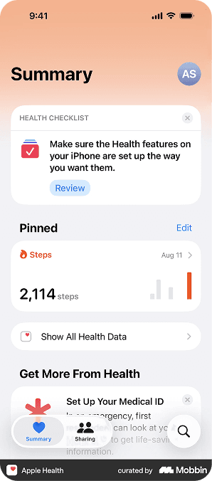
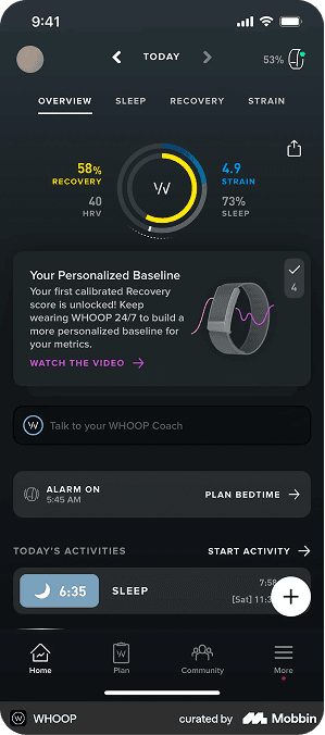
Apple Health, Whoop, and Oura were benchmarked to understand where the category was strong and where it fell short. The pattern was consistent across all three — they excelled at data collection and struggled at guidance. They told users what their body had done. None of them told users what to do next. That gap was exactly where Sol was designed to live.
4. Ideation and direction
With research locked, ideation focused on one question: what does a health app look like when it leads with rhythm instead of scores? The answer shaped everything — the home screen, the daily state model, the way analytics were visualised, and how the Dynamic Island integration was approached. Every screen had to feel like guidance, not reporting.
Research & Findings
What we learned before touching the interface.
Building an understanding of wearable and health apps
Before any ideation, the work started with reading. Articles on wearable technology, how health apps process biometric data, and what types of body metrics they can actually track. This was done deliberately — to understand the space well enough to know what was worth building and what was already being done poorly.
Three key articles shaped the early direction, covering what wearables are, how they work in medical and consumer contexts, and how the category has evolved. A deeper dive into the competitive landscape followed from there.
Constraints identified early
Four constraints surfaced before a single screen was designed. These were not assumptions — they were patterns that kept appearing across research:
+ Wearable data is noisy and incomplete
Sensors miss readings, signals degrade with movement, and gaps in data are inevitable. The design had to hold up even when inputs were imperfect.
+ Users don't understand most health metrics
Heart rate variability, respiratory rate, blood oxygen — these mean very little to the average person without context and translation.
+ Scores create anxiety and compulsive checking
A single number that resets every day encourages users to optimise for the score rather than their actual health. Sol needed to move away from this entirely.
+ Guidance needs timing, not frequency
One well-timed nudge is worth more than ten generic reminders. The when matters as much as the what.
What people actually struggle with
Users do not think about their health in terms of metrics. They think about their day. The real questions they are asking are:
"I don't know what to do today."
"I don't know when to do it."
"I don't know how hard to push."
"I don't know if I'm pacing well over time."
Nobody wakes up thinking "I want heart rate" or "I want HRV." They wake up wanting to know what their body is ready for. That gap between how apps speak and how users think was the core design problem Sol needed to solve.
Bodies operate in rhythms, not scores
Human physiology does not reset every day like a score. It moves in continuous patterns across hours, days, and weeks. Energy rises and falls during the day. Recovery improves or degrades across nights. Sleep quality stabilises or destabilises across weeks. Stress accumulates and releases in patterns.
Designing around this rhythm rather than a daily score was the single most important shift in the entire project. Everything that followed — the home screen, the insights model, the way time is visualised — came from this one insight.
Metrics that can be tracked with proficiency
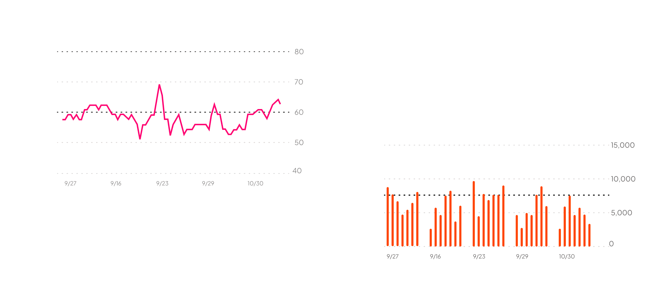
Not all data is worth showing. A focused set of signals emerged from research that are both meaningful and accessible without requiring clinical hardware:
Heart rate trend, sleep duration and quality, activity and workouts, and HRV translated into a recovery signal. These four inputs alone are enough to power a daily health state, meaningful insights, personalised fitness plans, and detailed analytics views.
Optional signals — blood oxygen, respiratory rate, nutrition macros, environmental alerts — can layer on top without cluttering the core experience.


How Sol sits against the market.
Three products dominate the premium health tracking space. Each excels in a specific area and falls short in the same place — guidance. They report on the body. Sol guides it.
| Dimension | WHOOP | Apple Health | Oura Ring |
|---|---|---|---|
| Core Focus | Recovery, strain and performance for athletes | All-around health and fitness ecosystem | Sleep and wellness insights, sleep first |
| Sleep Tracking | Very strong — sleep performance percentage and sleep need estimation | Good basic tracking, recently added sleep score but less detailed than ring solutions | Best-in-class sleep insights with detailed staging and trends |
| Recovery Insights | Excellent — combines HRV, sleep, and strain into recovery signals used for guidance | Limited direct recovery interpretation, focuses more on raw metrics | Strong recovery metrics tied to sleep and HRV trends |
| Activity and Fitness | Strain focus — workload, exertion, injury prevention | Full fitness suite with workouts, GPS, pace, zones — best for multi-sport | Basic activity tracking, steps and simple activity |
| Heart Rate Metrics | Continuous HR trends, HRV emphasized | Very accurate real-time HR, adds ECG and AFib detection | Resting HR and HRV included, deep sleep HR trends |
| Scoring and Insights | Personalised readiness, recovery and strain scores with coaching nudges | Aggregates raw data, sleep score exists but often higher than Oura test scores | Sleep score, readiness trends, temperature and biometrics tied to predictions |
| Integration | App with subscription-based insights, no watch interface | Deep iOS integration, third-party apps via HealthKit | Ring focused, integrates with Apple Health for broader ecosystem |
| User Experience | For users who want performance and training optimisation | For general wellness with smartwatch convenience | For users who want deep, passive health and sleep insights |
| Business Model | Membership required for full insights | Core platform free, Apple Watch hardware cost | Membership required for premium insights |
Tap any dimension to compare details
Recovery, strain and performance for athletes
All-around health and fitness ecosystem
Sleep and wellness insights, sleep first
Where Sol takes the lead.
Insight over scores
All three competitors lead with daily scores. Sol interprets rhythms instead, giving users direction rather than a number to optimise.
Proactive guidance
Whoop nudges based on recovery. Sol extends this with causal understanding and context, surfacing the right action at the right moment.
Sleep depth
Oura leads on sleep tracking. Sol learns how deep sleep and recovery trends influence daily energy and makes that connection visible to the user.
The gap none of them fill
Timing. None of the three tell users when to act on their data. That is exactly where Sol lives.
Ideation
From insight to idea.
With research locked and constraints defined, ideation focused on one central question: what does a health app look like when it leads with guidance instead of data? The answer did not come from adding more features — it came from stripping the model back to something much simpler.
The Core Idea
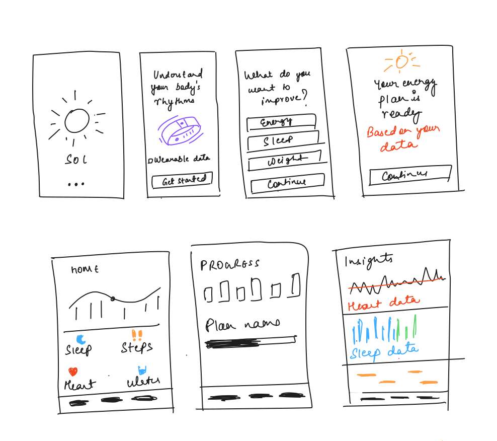
User selects a goal. Wearable provides data. Sol converts that data into actionable insights and analysis of the body.
That is the entire product in one sentence. The elegance of it was intentional. Every feature, every screen, every design decision had to serve this loop — goal, data, guidance. Anything that did not fit was cut.
Key Features Defined
Three features emerged from ideation as the non-negotiables:
Rhythm-centred Insights
One clear insight at a time. Not a dashboard of metrics — a single, well-timed nudge that tells the user exactly what they need to know right now. Quiet, unobtrusive, always relevant.
Pattern-Driven Plan System
Plans that are goal-oriented and adapt as patterns change. Sleep and Energy is one plan, not the whole product. Build Strength is another. Lose Weight is another. Each plan pulls from wearable inputs and produces a specific set of outputs tailored to that goal.
Trend-First Progress View
Progress shown as direction and stability over time, not isolated daily values. A weight trend chart that shows where things are heading. A sleep pattern view that shows whether consistency is improving. The question Sol answers is not 'how did I do today' but 'am I moving in the right direction.'
Design Principles
Four principles were set before a single screen was designed. These were not aesthetic guidelines — they were behavioural commitments about how Sol would treat the user:
No scores, rankings, or labels that make users feel evaluated
The body is not a test to pass. Sol avoids any language or visual pattern that creates judgment. No recovery percentage. No readiness score. No ring to close.
The body does not restart every morning
Sol focuses on trends, direction, and stability over time rather than isolated daily values. A bad night's sleep is contextualised against the week, not treated as a failure.
Users want to know what to do first. Explanations come second
Guidance is always the lead. Data and reasoning are always accessible but never in the way of action. The user should never have to read before they can act.
The goal is better decisions, not a report card
Sol is designed to help people make better decisions about their own body — not to tell them how well they are doing.
Assumptions
Three assumptions underpin the entire product model. These were not ignored — they were documented deliberately so the design could account for the moments when any of them breaks down:
Data exists — the user has a wearable that is actively tracking.
Permissions are granted — the user has consented to share biometric data with Sol.
The system is reliable — sensor data is accurate enough to generate meaningful patterns over time.
Concept
Introducing Sol
Most health products are built around measurement. Users are presented with sleep scores, recovery metrics, readiness indicators, and activity data, then expected to interpret what those numbers mean for their day.
During research, I noticed a disconnect. People rarely ask for more data. Instead, they ask simpler questions:
"How am I doing today?"
"Should I train or recover?"
"Why do I feel different than yesterday?"
Sol was born from that observation.
Named after the Spanish word for Sun, the product takes inspiration from something predictable, cyclical, and non-judgmental. People don't compete with the sun or optimize for it. They simply understand its patterns and plan around them. Sol applies the same philosophy to the human body.
Rather than functioning as another health dashboard, Sol acts as a planning system powered by biometric data. By combining wearable signals, behavioral patterns, and contextual inputs, the product translates complex health information into practical recommendations that help users make better decisions throughout the day.
The goal wasn't to build a tool that tracks health. The goal was to build a product that helps people act on it.
Core Product Idea
Helping users decide what to do next.
Most health products focus on helping users understand their data. Sol focuses on helping users decide what to do next.
That distinction became the foundation of the product.
Through research, I noticed that users rarely struggle to access health information. Modern wearables already provide sleep scores, recovery metrics, heart rate trends, and activity data. The challenge is translating those signals into meaningful actions.
People don't wake up wanting more health data. They wake up wanting answers.
"Should I push harder today?"
"Should I prioritize recovery?"
"Why am I feeling low on energy?"
"Am I making progress toward my goal?"
Instead of creating another dashboard filled with metrics, I explored what a health product would look like if it functioned more like a decision-making system.
The Core Concept
Turn biometric data into personalized actions.
Rather than asking users to interpret complex signals themselves, Sol continuously analyzes wearable data, behavioral patterns, and contextual inputs to recommend what matters most in the moment.
This shift reframed the product from a tracking tool into a personal operating system for health.


Design
Onboarding: Sol is not here to track you. It's here to guide you.
The onboarding experience was designed to communicate a simple idea: Sol is not here to track you. It's here to guide you.
Most health applications begin with permissions, integrations, and device setup. While necessary, these steps often feel disconnected from the user's actual motivation for downloading the product.
I wanted onboarding to start with intent rather than technology.
Users first define what they care about improving, whether that's increasing energy, building strength, improving sleep, or losing weight. This goal becomes the lens through which Sol interprets incoming data.
From there, wearable devices and preferences are connected progressively, helping users understand why data is being collected and how it contributes to future recommendations.
By the end of onboarding, users don't just understand what Sol measures. They understand how Sol thinks.
That distinction became important because the success of the product depends on trust. Users need confidence that recommendations are aligned with their goals rather than being generic health advice.
Plans: Organizing the experience around goals.
One of the earliest decisions I made was to avoid building another health dashboard.
Most health products present users with the same collection of metrics regardless of what they are trying to achieve. Sleep, recovery, heart rate, activity, and dozens of other signals are surfaced equally, leaving users to decide what matters and what action to take.
During research, I found that people rarely think in metrics. They think in outcomes.
They want more energy during the day. They want to build strength consistently. They want to lose weight without constantly questioning whether they're making progress.
This led to the concept of Plans.
Instead of organizing the product around health data, Sol organizes the experience around goals. Users begin by choosing an outcome they care about, and Sol continuously adapts guidance based on how their body responds over time.
A Sleep & Energy plan prioritizes recovery signals and energy patterns. A Weight Loss plan focuses on sustainable behavior changes and trend analysis. The same underlying data exists, but its interpretation changes based on user intent.
This shift transformed Sol from a passive tracking tool into an active guidance system.
The goal was to ensure users never had to ask, "What am I looking at?" and instead focus on "What should I do next?"
App Structure: Focused Navigation
Once the concept of Plans was established, the next challenge was deciding how users would navigate the product over time.
Most health applications gradually evolve into collections of disconnected features. Dashboards live in one tab, analytics in another, coaching elsewhere, and educational content becomes a separate destination entirely. As products grow, users often lose sight of what actually matters.
I wanted Sol to feel more focused.
The structure was intentionally built around four core areas: Home, Progress, Insights, and Plans. Each section serves a distinct purpose while contributing to a single goal of helping users understand and act on their body's patterns.
Home acts as the daily orientation layer, surfacing what matters right now.
Progress answers whether current behaviors are leading toward desired outcomes.
Insights provides deeper context and education for users who want to understand the reasoning behind recommendations.
Plans serve as the long-term framework that connects user goals with wearable data and behavioral guidance.
This structure helped maintain clarity as the product expanded. Instead of asking users to learn a complex system, each section answers a specific question:
Home
"What should I do today?"
Progress
"Am I improving over time?"
Insights
"Why is this happening?"
Plans
"What am I working toward?"
By organizing the product around these questions rather than around metrics, Sol feels less like a tracking tool and more like a decision-making companion.
Device Pairing: Connecting Capabilities
Most wearable onboarding experiences focus on technical integration. Connect a device, grant permissions, and start collecting data.
I wanted the pairing experience to reinforce a different idea.
In Sol, wearable devices are not the product. They are simply a source of signals that help the system understand the body. The experience was intentionally designed to feel lightweight and trustworthy, helping users understand why data is being collected rather than overwhelming them with technical details.
This became particularly important because the quality of guidance depends heavily on the quality of incoming data. By positioning wearables as contributors rather than the center of the experience, the product maintains its focus on outcomes rather than metrics.
The goal was to make device connection feel like enabling a capability rather than completing a setup task.
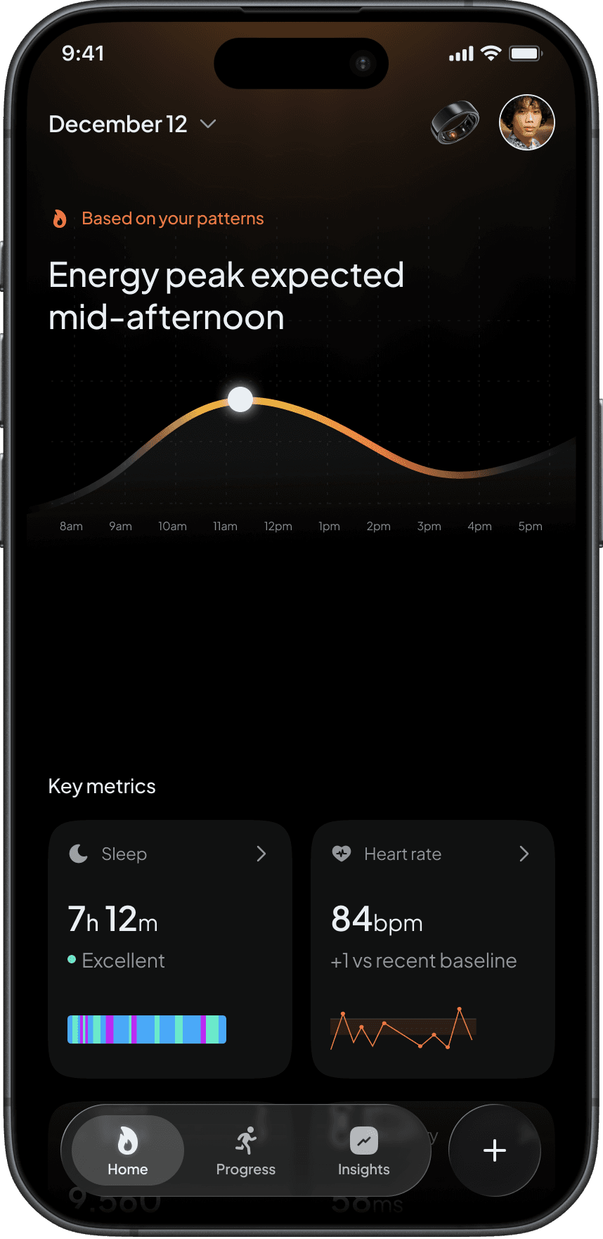
Home: Daily Orientation Layer
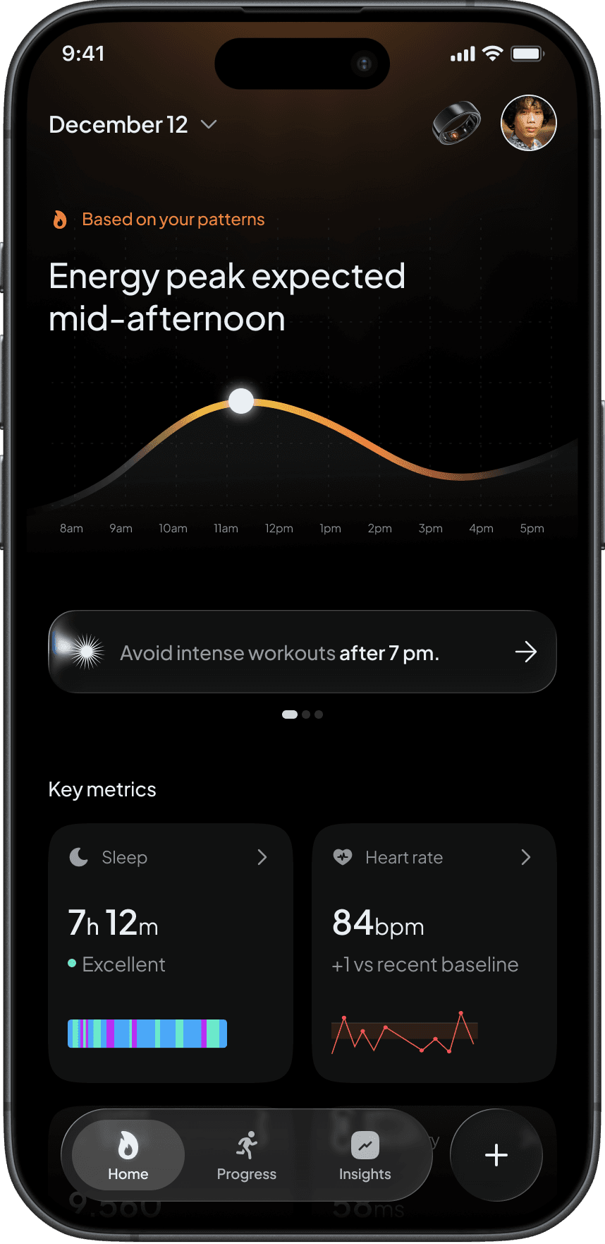
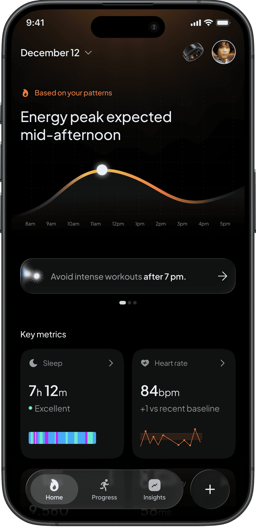
The Home experience acts as the product's daily orientation layer.
During research, one insight surfaced repeatedly. People rarely wake up wanting to check their recovery score or sleep chart. What they actually want to know is whether they should push harder, slow down, focus, recover, or adjust their plans for the day.
This led to a deliberate decision to avoid treating Home as a dashboard.
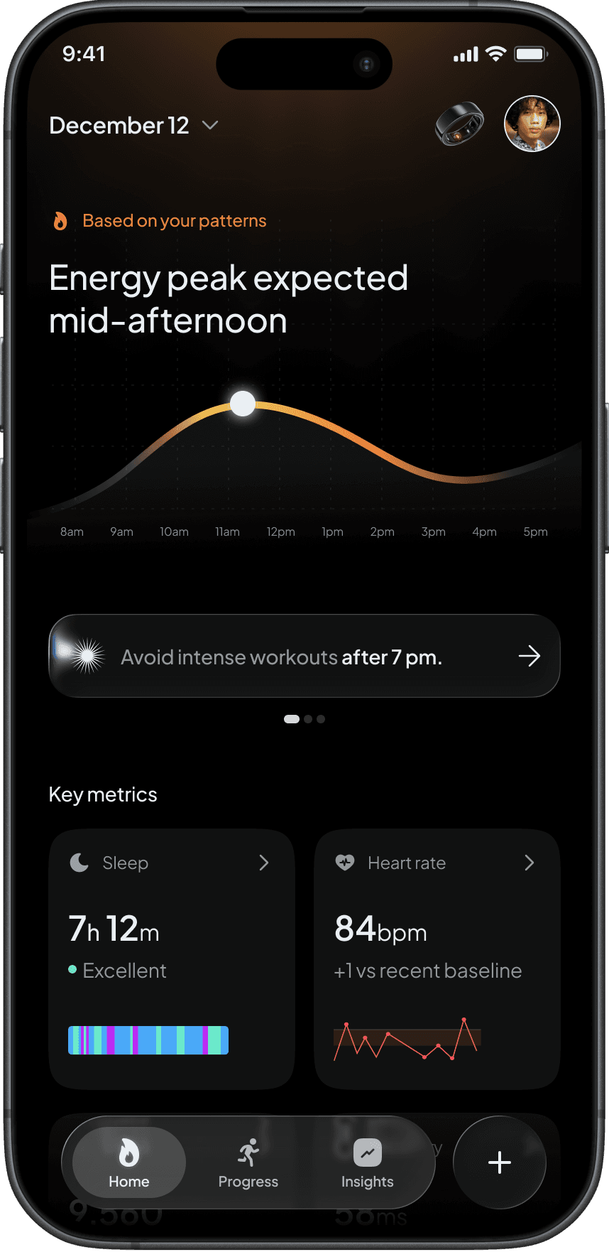
Instead of surfacing dozens of competing metrics, Sol presents a single primary insight supported by contextual signals. Recommendations such as "Energy peak expected mid-afternoon" or "Avoid intense workouts after 7 PM" are designed to answer a question before users have to ask it.
Supporting metrics remain visible, but they serve a different role. Rather than demanding attention, they provide evidence behind the recommendation.
This shifts the interaction from monitoring health to acting on it. The screen becomes less about information consumption and more about decision-making.
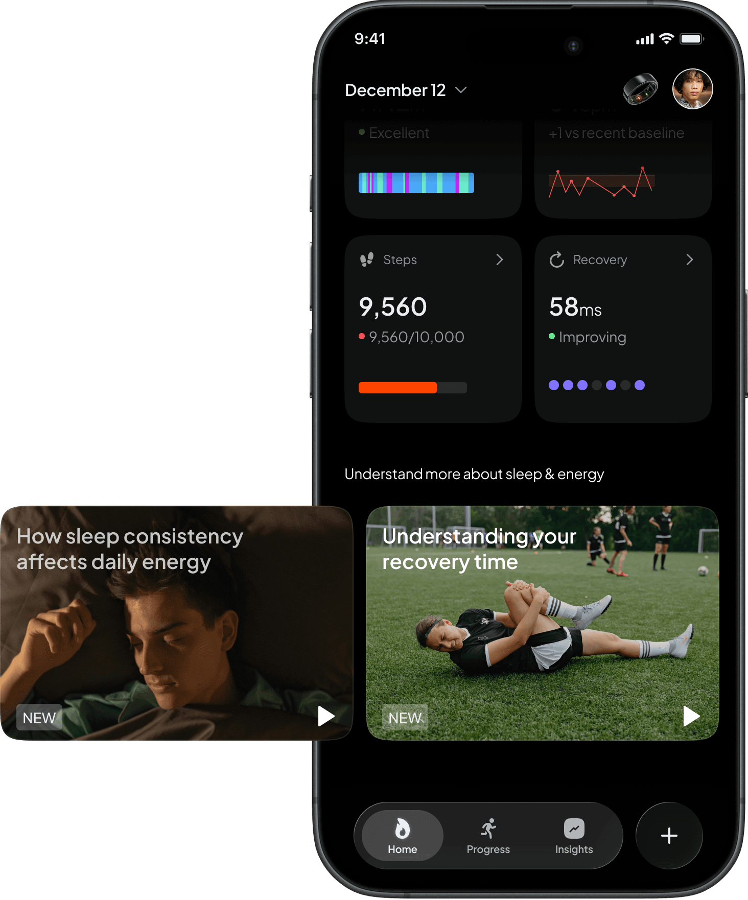
Educational Content: Contextual Learning
One challenge I identified early was that health insights often stop at observation.
Many products can tell users that recovery has dropped or sleep quality has declined, but very few help them understand what those changes actually mean or how to respond.
Rather than creating a separate content hub filled with articles and videos, I explored a more contextual approach.
Educational content is surfaced only when it supports a user's current situation. If sleep consistency becomes a recurring factor in energy levels, relevant content appears directly within the experience. If recovery trends suggest increased strain, users receive targeted explanations that help them better understand the signals behind the recommendation.
The goal was to make learning feel timely and actionable rather than forcing users to actively search for information.
Another important consideration was content fatigue. Instead of overwhelming users with endless videos and resources, educational modules are intentionally limited and contextual. Every piece of content exists to clarify an insight, reinforce a recommendation, or help users build a stronger understanding of their own health patterns.
This also creates a natural opportunity for premium experiences. Advanced educational content, expert-led guidance, and deeper learning pathways can be introduced as part of a subscription offering while maintaining the product's core philosophy of delivering value before asking users to pay.
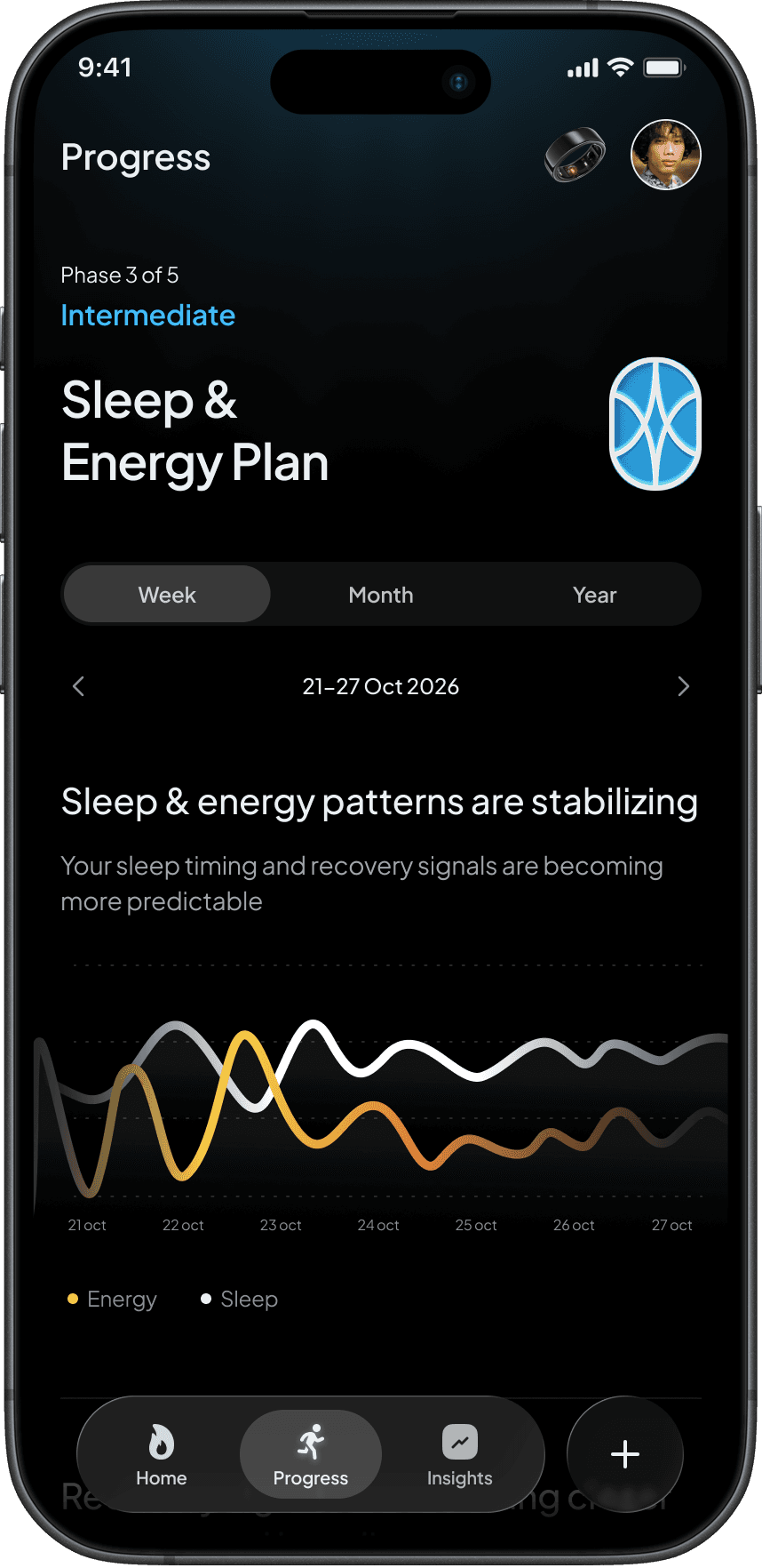
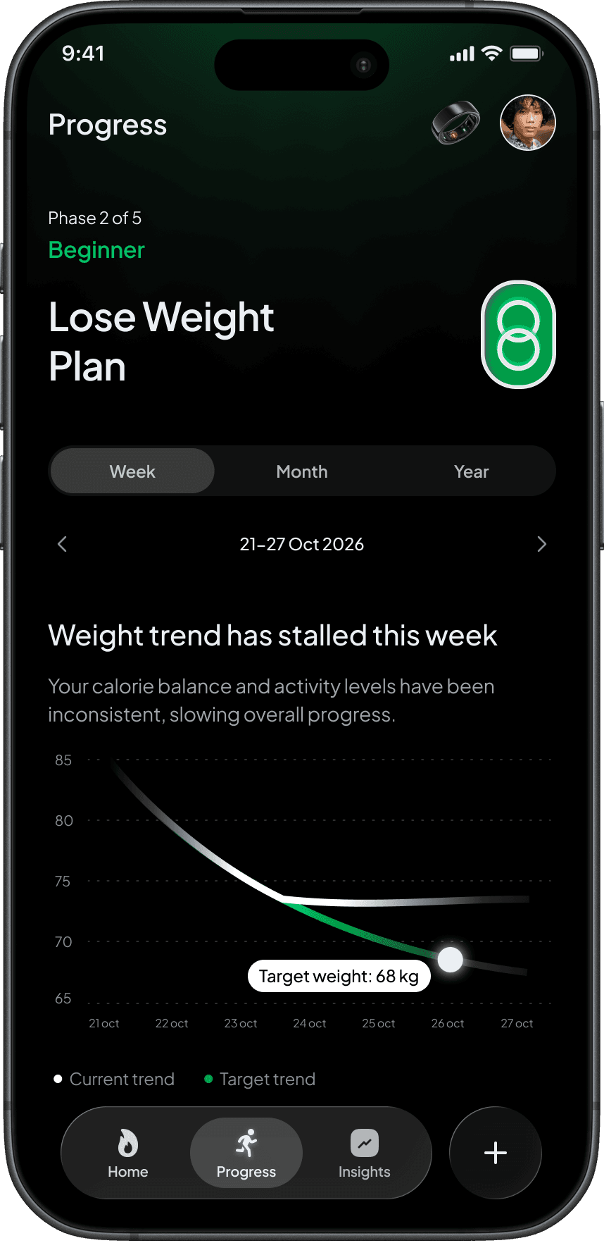
Progress: Sustained Rhythms over Time
Most health products evaluate users through daily scores.
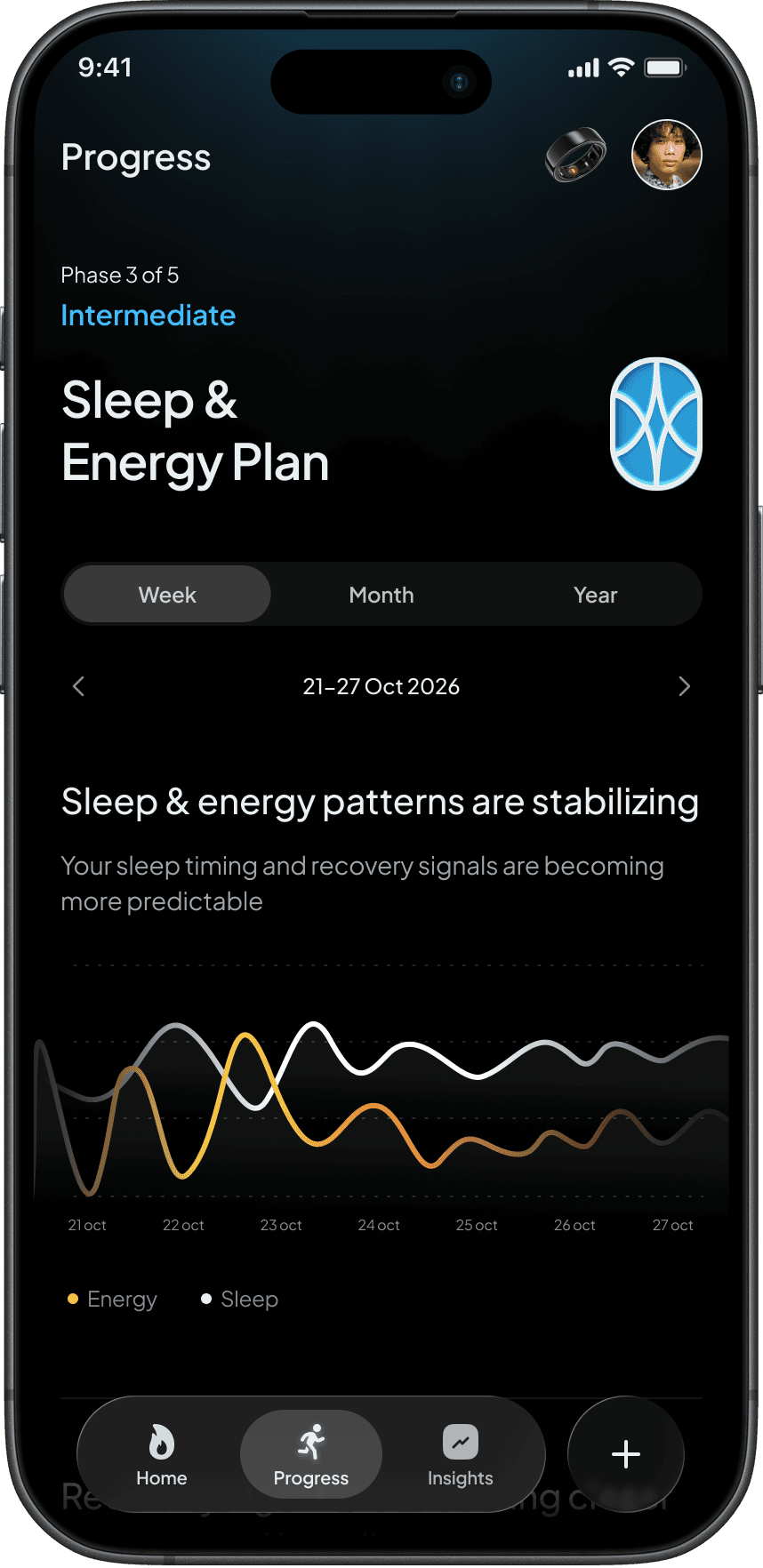
A single night of poor sleep, a missed workout, or a lower recovery score can make it feel like progress has disappeared. In reality, the body doesn't operate in daily snapshots. Meaningful change happens through patterns that emerge over weeks and months.
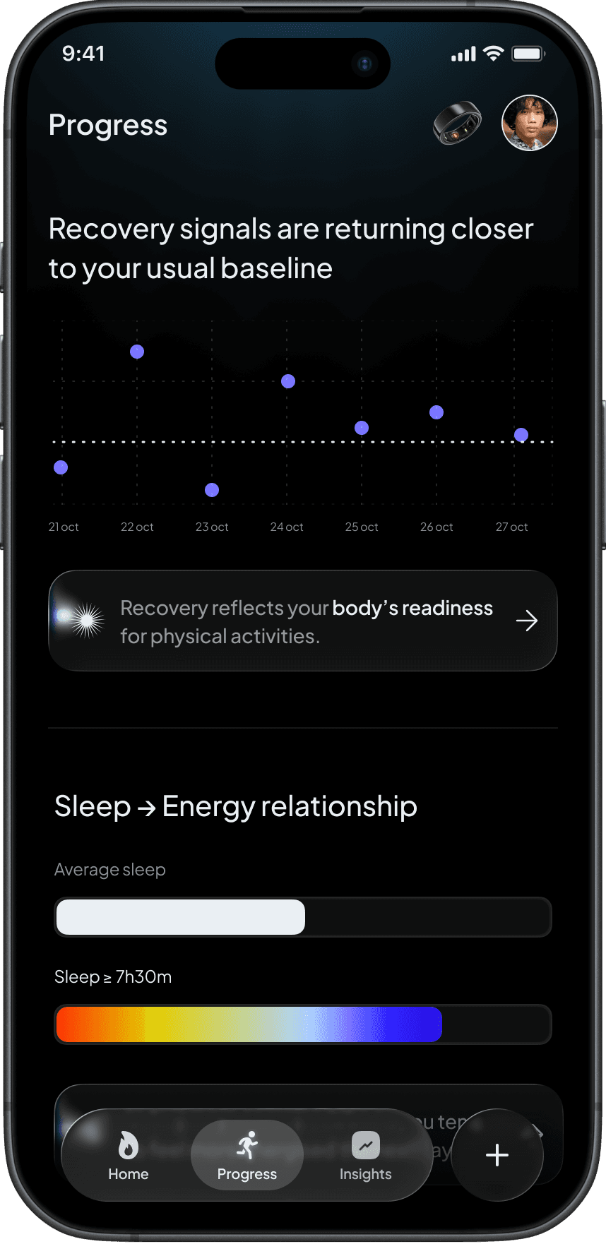
The Progress experience was designed around a different question: "Is this plan working over time?"
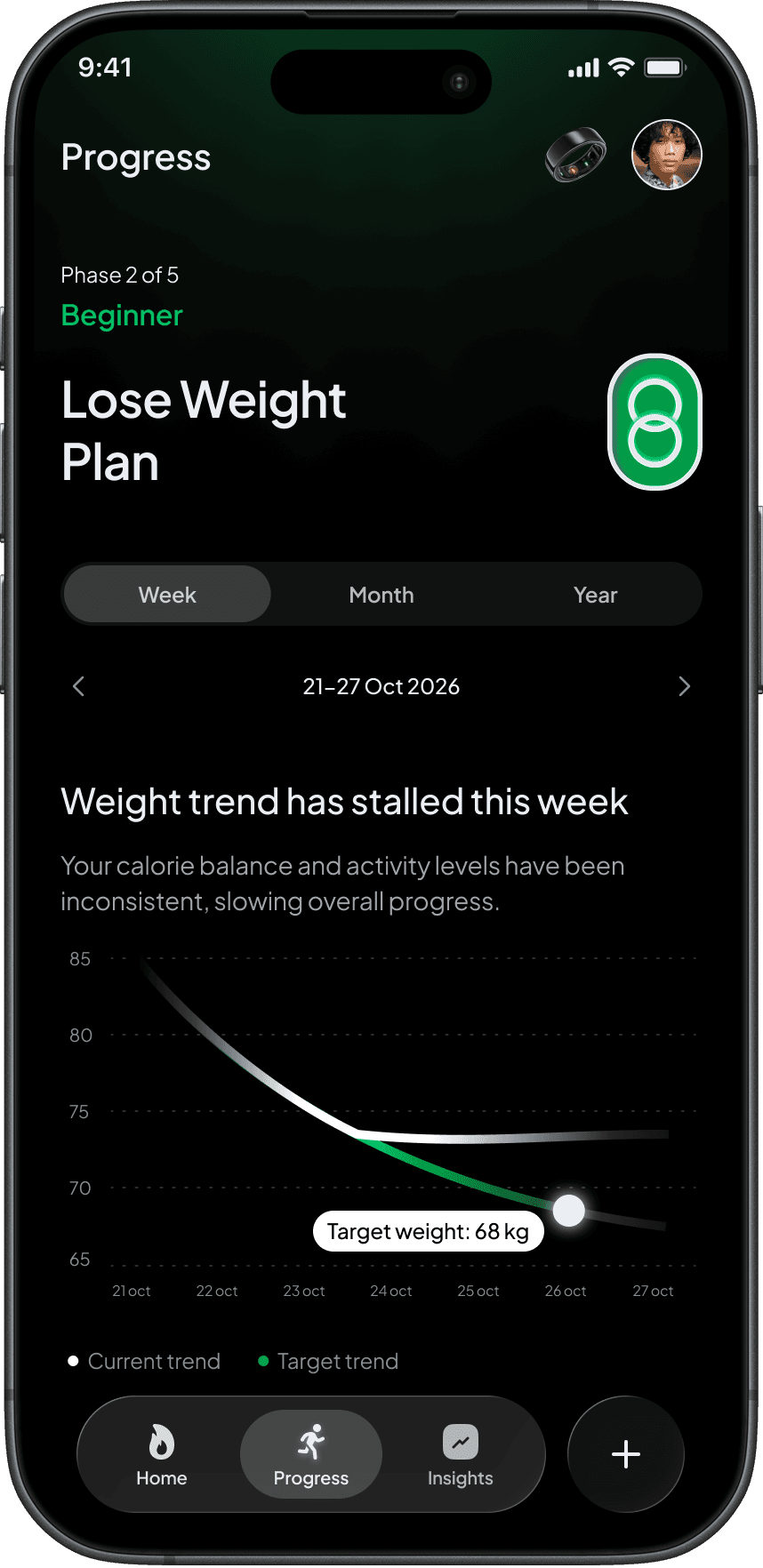
Instead of focusing on isolated metrics, this section takes a longitudinal view of health. Weekly, monthly, and yearly trends help users understand how behaviors evolve and whether they are moving toward their goals in a sustainable way.
A key design decision was redefining what progress means. Many health products equate progress with constant improvement, which can create unrealistic expectations. Sol treats progress as stability and alignment rather than perfection. Consistent sleep patterns, predictable energy levels, and sustainable recovery trends are often more valuable than short-term peaks.
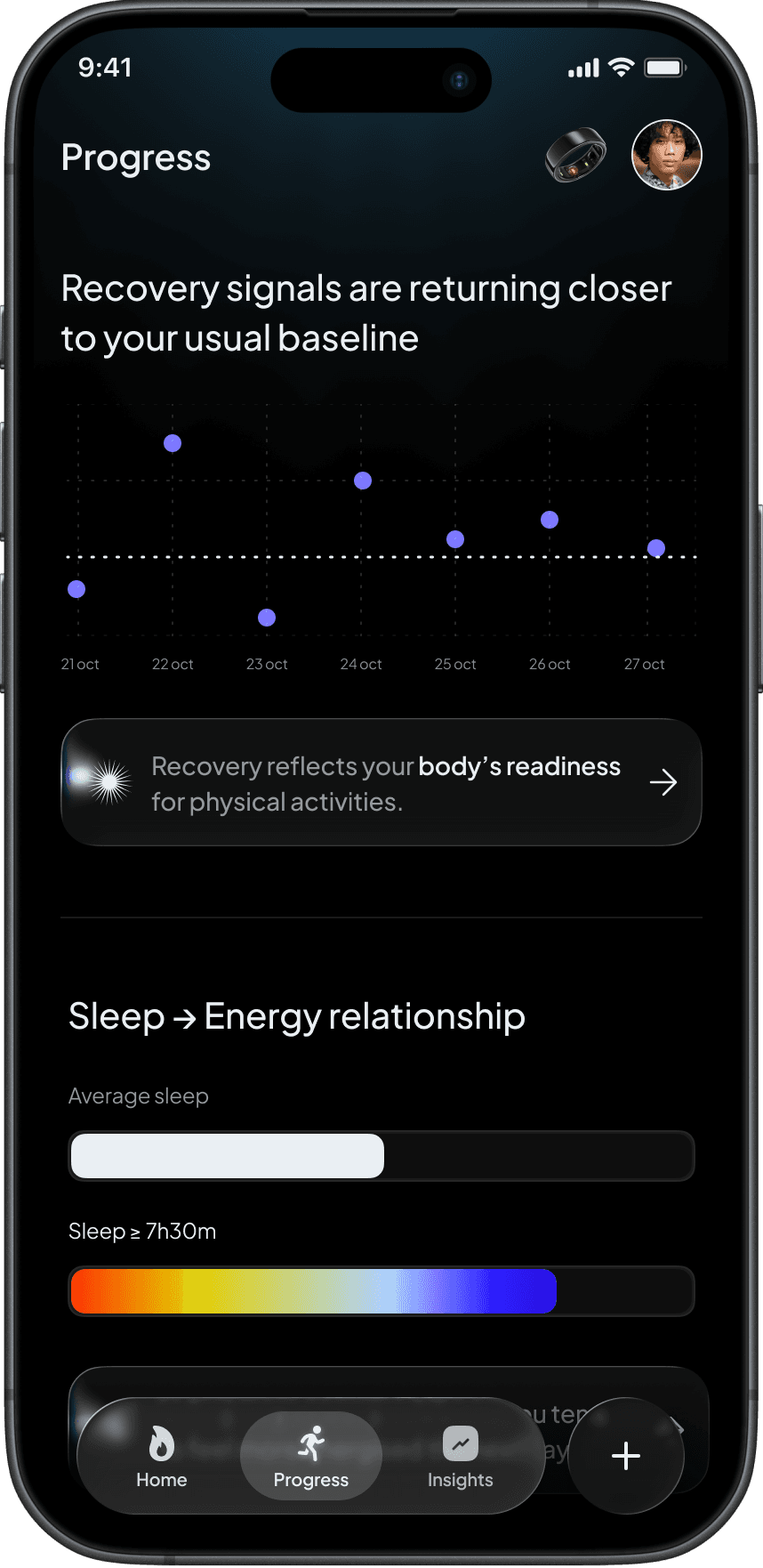
To support this, trend visualizations are paired with concise explanations that help users understand what they're seeing without requiring them to interpret graphs on their own. The AI layer remains present throughout the experience, continuously connecting patterns, behaviors, and outcomes to provide context around changes over time.
Rather than asking users to judge each day individually, Progress helps them step back and understand the bigger picture. The goal is not to optimize every day. The goal is to build healthier rhythms over time.
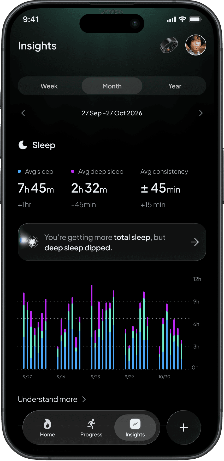
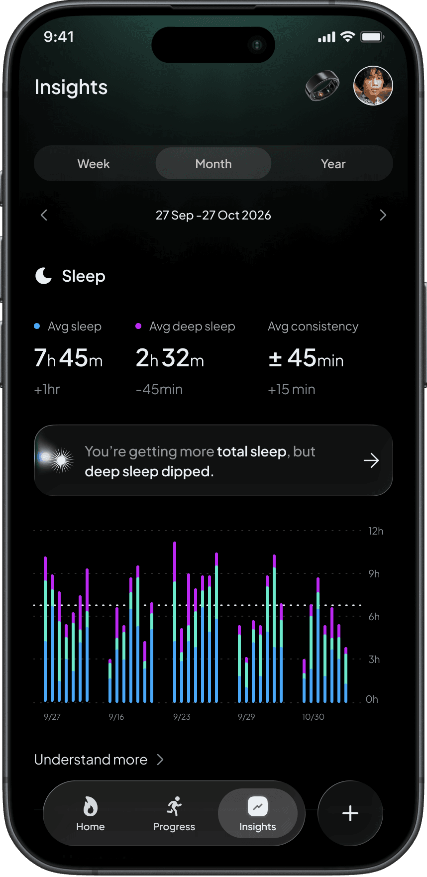
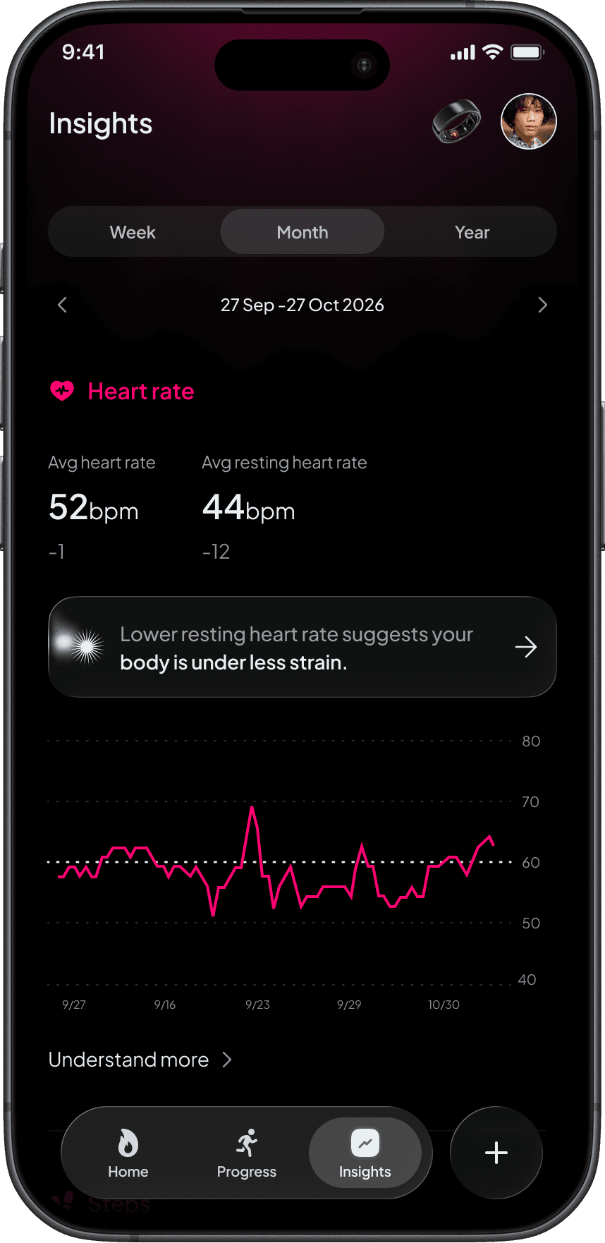
Insights: Explaining the Data
While Home focuses on action, Insights focuses on understanding.
One challenge I noticed across health applications is that users are often given more information than they can realistically process. Charts become increasingly complex, but clarity doesn't necessarily improve.
Insights was designed as an optional educational layer that helps users explore the reasoning behind recommendations without overwhelming them.
Every visualization is paired with explanation. Rather than simply showing that sleep quality decreased or recovery improved, Sol explains the relationship between behaviors, patterns, and outcomes.
The goal was not to create a library of analytics. The goal was to help users build confidence in the guidance they receive and gradually develop a deeper understanding of their own rhythms.
Sol AI: Intelligence in the Background
AI sits at the center of the experience, but intentionally remains in the background.
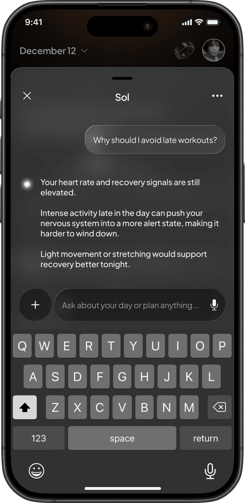
Many AI-powered products position intelligence as the primary feature. Sol takes the opposite approach. AI exists to interpret information and reduce complexity rather than draw attention to itself.
The system continuously evaluates trends, timing, recovery signals, and recent behavior to identify moments where guidance can genuinely influence decisions. Recommendations appear when context matters, not through constant notifications or interruptions.
A key part of the experience is explainability. Users can ask why a recommendation was made and receive transparent reasoning tied to their own data and patterns. This creates trust while helping users learn from the system over time.
The objective was never to make AI visible everywhere. It was to make it useful at the right moment.
Contextual Monetisation, Not Interruptions
Most subscription products introduce paywalls at moments of friction. Users attempt to access a feature and are immediately blocked by an upgrade screen.
I wanted monetisation to feel more aligned with user intent.
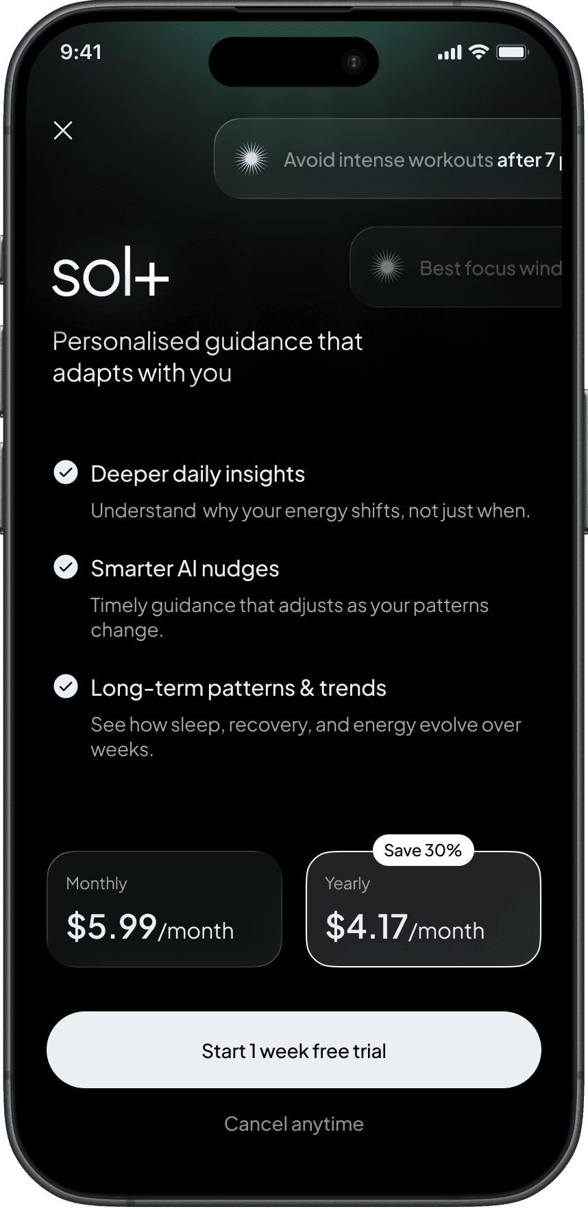
Sol+ is introduced only when users actively seek deeper understanding of their health patterns. Instead of interrupting workflows, premium features appear naturally within moments of curiosity and exploration.
This approach aligns monetisation with value. Users are not paying for access to the product. They are paying for a richer understanding of themselves.
The result is a premium experience that feels additive rather than restrictive.
Contextual Logging: Filling the Gaps
Wearables are incredibly effective at measuring physiological signals, but they lack context.
A poor night's sleep could be caused by travel. Elevated stress might be linked to work. Reduced recovery may have nothing to do with exercise at all.
Without context, data only tells part of the story.
Rather than introducing heavy manual logging, Sol provides lightweight contextual inputs that allow users to capture meaningful life events such as illness, stress, travel, unusual schedules, or workout intensity.
These moments help the system understand why changes occurred rather than simply detecting that they happened.
The goal was to create a more complete picture of wellbeing while keeping user effort close to zero.
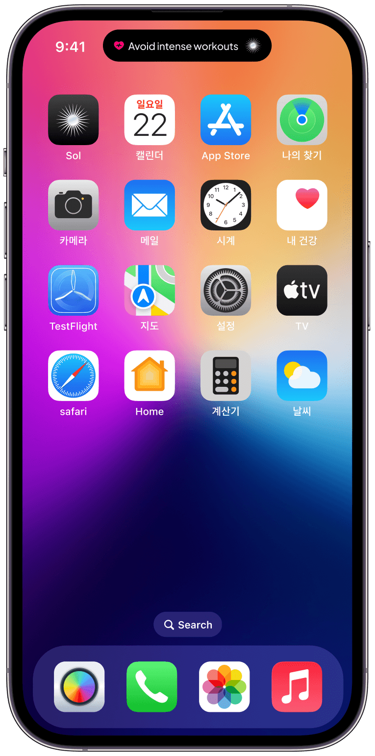
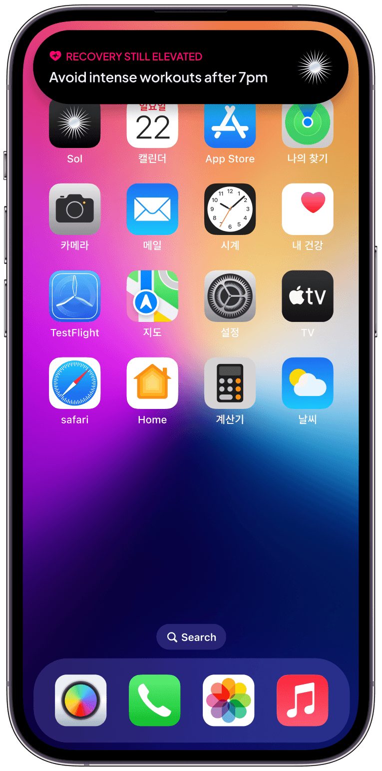
Dynamic Island: Glanceable Actions
Health products often rely on notifications that arrive too frequently or too late.
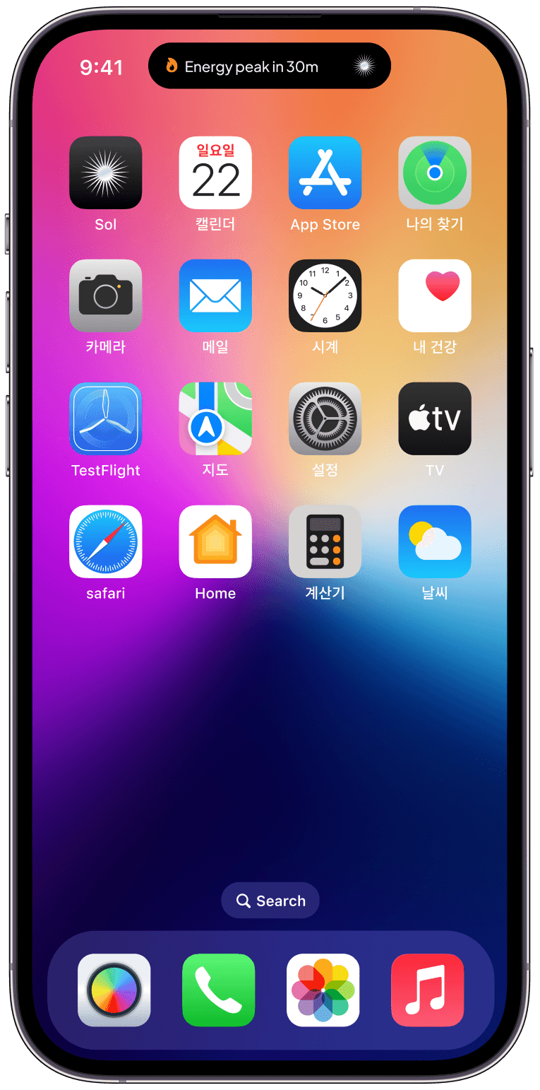
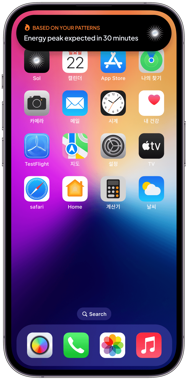
I explored Dynamic Island as a way to surface guidance in a more timely and glanceable format. Instead of demanding attention, recommendations appear naturally within moments where users can still act on them.
Whether highlighting an upcoming energy peak, elevated recovery levels, or a recommendation tied to a user's plan, these nudges extend the product beyond the application itself and into daily routines.
The experience feels less like a notification system and more like a subtle companion that understands when guidance is useful and when silence is better.
Vision
What Sol Could Grow Into
Designing Sol started with a simple question: What if health products stopped measuring people and started guiding them?
While the current concept focuses on sleep, recovery, activity, and energy management, the underlying system was intentionally designed to be extensible. The real opportunity isn't in tracking more health metrics. It's in becoming a trusted layer that helps users make better decisions across different areas of wellbeing.
Over time, Sol could evolve beyond health tracking into a more comprehensive personal guidance system. Nutrition, stress management, mental wellbeing, habit formation, and even work-life balance could become part of the same ecosystem, all interpreted through the lens of individual goals and daily context.
What makes this particularly interesting is that the value doesn't come from collecting more data. It comes from building a deeper understanding of patterns. As the system learns how users respond to different behaviors, recommendations become increasingly personalized, shifting from reactive insights to proactive guidance.
The long-term vision isn't to become another dashboard filled with metrics. It's to become a system that quietly understands your rhythms, helps you make better decisions, and fades into the background when it isn't needed.
For me, Sol became an exploration of a broader design question:
How might we design technology that helps people live healthier lives without demanding constant attention in return?